Advertisement

Table Of Contents
Key points
Like several of its discount brokerage peers, National Bank Direct Brokerage has opted to use a mobile-friendly website to enable users with mobile devices such as smartphones and tablets to access and manage their investment accounts. As such, no special apps are required in order to access the mobile trading features of a user’s online […]
Like several of its discount brokerage peers, National Bank Direct Brokerage has opted to use a mobile-friendly website to enable users with mobile devices such as smartphones and tablets to access and manage their investment accounts. As such, no special apps are required in order to access the mobile trading features of a user’s online brokerage account. The mobile website can be found at www.nbdb.ca when accessed with a mobile device browser.
In this review, I walk through the various features of the National Bank Direct Brokerage mobile trading website. The video below provides an in-depth walk-through of the features of the website in action as well as a demo on what placing a trade on their mobile platform is like. As it goes into quite a bit of detail, the video is a bit long so if you are interested in seeing the walk-through on placing a trade, you can skip to 17:33 to view it.
Methods
For this review, I used an iPhone 4S with a 4G internet connection and conducted the test from downtown Vancouver. Although I was downtown, the signal strength in my particular location was about 50% – 75% full so my internet connection may have resulted in a slower browsing experience.
Functionality
The mobile trading website from National Bank Direct Brokerage offers features most online investors will find helpful when managing positions and accounts and is generally well-designed. The following table provides a highlight of the kinds of activities you can expect (or not expect) to do via the mobile website:
| What you Can do | What you Cannot do |
|---|---|
| Trade Stocks | Trade Options |
| Monitor Positions – use watchlists – monitor open positions | Get Detailed Quotes on ETFs |
| Monitor Accounts – view balances – view transaction history | Get Market/Trading Depth |
| Move Money Between Accounts | Get Currency/Commodity Quotes |
| Get Stock Quotes (snap quotes) | |
| Read Market News | |
| Do Basic Research on Markets |
Basic Design and Layout
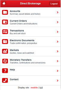
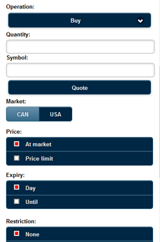
The mobile website is well-designed and intuitive. The homepage looks and feels more like an app menu than it does a mobile website. It uses icons and text effectively so there is very little guessing when it comes to navigating through sections of the mobile website. Sections, such as the order entry use a good combination of buttons, colours and spacing to orient users through the important fields.


Some of the downsides of the design are in the quote entry. When typing in a symbol to obtain a quote, for example, the user has to select from the list of suggested symbols that shows up below the entry field. At times the quotes got choppy (because of the internet connection) and the full drop down list was obscured by the keypad making it a challenge to quickly get to specific symbols. Of course there is also the nuisance of autocorrect to be on the lookout for when entering a symbol on a mobile device.
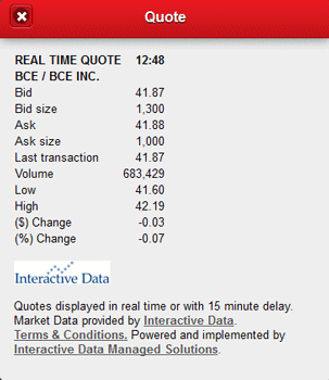
Another design shortcoming is in the order entry section, specifically with the price quote feature in that section. If a user wants a price quote on the symbol they wish to trade, another window opens up above the order entry window requiring the user to remember price information and then close the window to access the order entry window again. This could be problematic to users when entering in limit orders, especially if they are somewhat in a rush.
Speed and Data Consumption
In terms of speed, the 4G connectivity had a significant impact on what it was like to browse through the site and perform certain actions. For comparison purposes I tested the navigation on a wi-fi connection and it was noticeably smoother using wi-fi. This drives home the point that if users are planning to trade on a mobile device, the combination of browser, signal strength and internet speed are all extra variables to factor in. Because of the extra elements on a page and the amount of javascript, the page speed is a bit slower than if the page had fewer elements on it. Below are the sizes (in kilobytes) of the pages obtained from a one-time load:
- Menu Page: 418 kB
- Current Orders: 389.7 kB
- Account Details: 383.1 kB
- Transactions: 405.3 kB
- Markets: 297.3 kB
- Obtaining a Quote: 273.4 kB
- Watchlist: 273.5 kB
- Monetary Transfers: 388 kB
As you can see, the above visit consumed just under 3MB of data, with a typical page running between 300-400 kB. The page size helps to explain why at 50% – 75% signal the load times I experienced were a bit choppy. On a 4G or 4G LTE, page load times should, in theory, be very quick (Geek side note: 3G speeds are at best 3 Mbps and 4G LTE can hit up to 150 Mbps in theory).
Quotes & Research
The stock quotes provided by the mobile website are snap quotes. What that means is that every time a user requests a quote a ‘snapshot’ of the trading activity on that stock is taken and reported back to the user.
Quotes
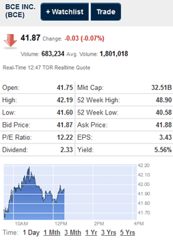
In terms of details, most of the relevant data points for a quick snapshot are provided for stocks but not for ETFs. For stock quote information, trading volumes (current day and average) are provided, as well as basic information on price to earnings ratio (P/E) and earnings per share (EPS). Dividend information such as the amount and yield are included, if applicable, however ex-dividend dates are not.


It was interesting to note that the quote data from the ‘get quote’ function on the “markets” page provided slightly different details on the stock than did the ‘quote’ function on the order entry page. Information on the bid/ask size would be nicer to have on the quote page before going through the process of entering a trade to find that information out.
Research
In addition to individual stock or ETF quotes, there is a good market activity reporting feature which covers most major Canadian and US indices and markets. Unfortunately there is no easy way to quickly access commodity or currency data and no way to customize the list of indices at this time.
One interesting research feature is that a breakdown of market activity by sector is provided for the TSX and for the DOW for those users interested in those particular markets.
User Support
One of the features of the National Bank Direct Brokerage mobile trading platform is that it provides strong support resources that explain what each section of the website does and how to use different features of the site. In addition, there is a contact link in the menu that makes it very easy to connect with a service agent. These are important features for users to have handy while accessing the site to perform transactions, monitoring or management.
Money Management
Another feature that is noteworthy about National Bank Direct Brokerage’s website is the money transferring feature. Getting money into and out of the trading platform is very intuitive and easy. This is particularly useful when users want to make or schedule contributions to registered accounts.
Conclusion
The National Bank Direct Brokerage mobile website is a good compliment to desktop trading platform but not an all-out replacement of it. It is well designed and supported so getting around the site is relatively easy. In terms of functionality, it also is able to do a lot of the essential features self-directed investors are likely to do, such as place trades, monitor account balances and transactions as well as conduct some basic market and stock research. There were a few limitations I encountered with the order entry process, such as having to flip back and forth on the order page and quotes page, as well as some limitations on getting ETF data. The speed of the site was reasonable; however the speed and page loads will depend on the browser, device and internet connection more than anything else.
| Strengths | Limitations |
|---|---|
| Moving money between accounts | Order entry quotes |
| Support | ETF quote details |
| Market information/data | Options trading |
| Site navigation |
The bottom line on the mobile website is that it offers most of what users will need if they want to manage their accounts and portfolios on the go. It is easy to use, well supported and with the exception of a few minor quirks, a good mobile platform.
Editor’s Note: The original published version of this review stated that the network speed was a 3G connection however the network speed in the area for the device used in the test can support up to 21 Mbps (4G). The network icon on the device indicates 3G however the reported network speed reported by the carrier is 4G and a network test found download speeds of 3.3 Mbps. As such the originally stated speed of 3G has been corrected to 4G.