Advertisement

Table Of Contents
Key points
This mobile trading website review covers the major features of Qtrade Financial’s MobileWeb as well as some of the strengths and limitations for self-directed investors looking to trade on the go on this platform. Access to the mobile website is possible by pointing a mobile browser to www.qtrade.ca. As with the previous mobile trading reviews, […]
This mobile trading website review covers the major features of Qtrade Financial’s MobileWeb as well as some of the strengths and limitations for self-directed investors looking to trade on the go on this platform. Access to the mobile website is possible by pointing a mobile browser to www.qtrade.ca.
As with the previous mobile trading reviews, a video walk-through was done (see below) to demonstrate what it is like to navigate through the different portions of the mobile website as well as what it is like to look up a quote.
Given the large number of features on the mobile trading website, the video is a bit long. For viewers who wish to skip to the conclusion/summary, simply go to the 23:50 mark in the video.
Methods
The review of the mobile trading website was done using an iPhone 4S and with a 4G internet connection. A screenshot (below) was taken before the test to illustrate the connection speed, which came in at 3.3 megabits per second (Mbps) on the download and 0.54 Mbps on the upload. The test was conducted from downtown Vancouver and the signal was about ¾ of full strength.
Functionality
Qtrade’s mobile website can be divided into two main categories of functionality – account/portfolio management and research.
From an account/portfolio management perspective, the mobile website allows a basic functionality by providing access to account balances from all accounts and consolidated views of positions and assets. Users of the website are able to trade stocks, options and mutual funds however these features weren’t tested in this review as a demo account was used that didn’t have those features enabled.
Users of Qtrade’s mobile website can also take advantage of the watchlist feature which enables tracking of stock symbols. Multiple watchlists can be created and the watchlists that users create online are accessible via the mobile website and vice versa.
Below is a table that summarizes some activities users of the mobile website can or can’t perform.
| What you Can do | What you Cannot do |
|---|---|
| Trade Stocks | Get currency quotes |
| Monitor Positions – use watchlists – monitor open positions | Look up stock symbols by keyword/company name |
| Monitor Accounts – view balances | Move funds between Qtrade accounts |
| Move Money Between Bank & Brokerage Accounts | View historical transactions/transfers |
| Get Stock Quotes (snap quotes) | |
| Read Market News | |
| Do Basic Research on Markets | |
| Get commodity quotes (end of day pricing) |
Basic Design and Layout
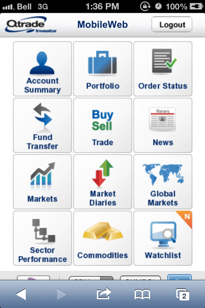
Qtrade’s MobileWeb relies heavily on icons to orient users through the website. The homepage is organized into a 3×4 grid (see left image below) from which users can access different functions or pages of the website.
From a design perspective, navigating sections takes some getting used to and while the icons on the homepage are labeled, the functionality of the icon is not described. The absence of descriptions can make it challenging for users to navigate to sections of the website quickly.
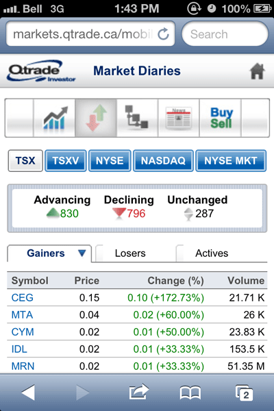
Navigating from section to section was made a bit more challenging by the use of ‘shortcut’ icons at the top of certain pages (see right image above). While they could be useful for doing similar or related kinds of activities, such as ‘managing a portfolio’ the lack of labels forces users to remember what section each icon is associated with. With 12 icons to remember, I found myself relying more on the homepage rather than the ‘shortcuts’ to move between sections.
Within each of the pages, the sections were reasonably clearly laid out and the research-related functions managed to provide lots of data without a user feeling overwhelmed. The use of tabs and buttons helped to keep information accessible without a lot of scrolling.
The device used in the test, an iPhone 4s, is also now on the ‘smaller’ end of the screen size scale when it comes to smartphones and superphones. Larger screen sizes would be able to access and display the layout of information without users having to scroll as much as they might have to on older devices.
Speed and Data Consumption
The pages on Qtrade’s mobile website were relatively light weight given the amount of information provided. While there were times when it noticeable lags in loading were detected, on the whole moving around between pages was reasonably fast even with limited connectivity. For comparison purposes, moving through the website is much smoother on a wifi or faster internet connection indicating that user experience will likely be impacted by internet connection speed.
Below are the file sizes of pages obtained on a single load. The sizes of pages were impacted on subsequent loadings, presumably because of browser caching – in English: the browser was able to remember some of the elements of the web page so didn’t have to download as much once a page was visited.
- Homepage: 82.9 kB
- Account Summary: 29.4 kB
- Order Status: 28.4 kB
- Fund Transfer: 32.1 kB
- News: 30.5 kB
- Portfolio: 22.6 kB
- Markets: 34.6 kB
- Market Diaries: 40.4 kB
- Global Markets: 23.7 kB
- Sector Performance: 41.1 kB
- Commodities: 23.3 kB
- Watchlist: 27.5 kB, 35.7 kB
- Quote: 30.8 kB
These page sizes are very small relative to other mobile websites tested so the data used by this website is minimal. As mentioned above, internet connectivity is likely to be the major factor influencing the speed of navigating through this site.
Quotes & Research
In terms of stock quotes and research, Qtrade’s MobileWeb is a tale of two cities. On the one hand, the quotes function is not as accessible or flexible as it needs to be when trying to look up a company’s stock symbol. On the other hand, the research components provided in the mobile website are robust and provide a great deal of information on markets, commodities and select stocks.
Quotes
The stock quotes provided are snap quotes, meaning that user needs to refresh a quote in order to get the latest price on it. For stocks, there are a number of fields that can be populated to provide information on the particular stock once a quote is obtained. It was great to be able to see the dividend information (yield, ex-dividend date, payout date) provided as well as the inclusion of technical and fundamental data. What was interesting to note was that even though certain fields, such as “Beta” or “market cap” were available, they weren’t populated meaning that the user gets presented with information they don’t need and can’t use.
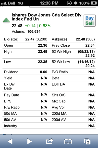
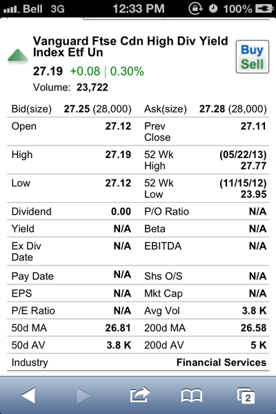
Looking up information on ETFs was an interesting experience in that the quotes returned less detail than a stock quote and sometimes provided information inconsistently. Information on the technical movements (e.g. 200d moving average) or the dividend yield were not provided consistently or at all in some cases. A quick test of two Canadian dividend oriented ETFs XDV (left image below) and VDY (right image below) showed no dividend related information in the quotes fields and only the latter had technical information (200d & 50d moving average and volume) populated.
Research
The research functions of MobileWeb are certainly its strongest feature. Half of the homepage menu icons point to different kinds of market research pages that quickly provide a birds-eye view of many different market components.
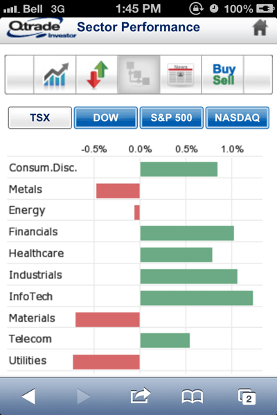
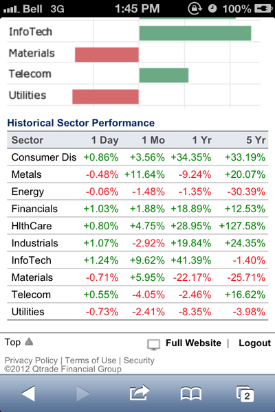
With Qtrade’s mobile website it is possible to research markets by sector of company for the major US indices as well as for the TSX and it is also possible to see changes across different time frames. This is a particularly nice feature as it lets users quickly spot and track sector performance using tables and graphs from a mobile device.
Another great feature that they’ve integrated from the full website into the mobile format is the commodity quote update. While the quotes themselves are restricted to end of day data, for longer term investors it is a handy way to stay on top of a lot of commodity information.
User Support
Help and user support from within the mobile website was restricted to the contact button on the homepage. There was no glossary or help section that explained the features of the website or examples of how to use it. While Qtrade’s client support is recognized as being quite strong, it was interesting that this feature was not well-integrated into the mobile website.
Money Management
Moving money into or out of a Qtrade account (i.e. to and from a bank account) had only basic functionality on the mobile website. Unfortunately accessing account histories and transferring between Qtrade accounts are activities that require the full website to do.
Conclusion on Qtrade MobileWeb
Qtrade’s mobile trading website provides users with access to essential functions required to manage their portfolios and monitor markets remotely.
The watchlists and research capability makes it easy for users to stay on top of existing positions or those that have already been identified via the full website.
Unfortunately, it seems like getting quote data is much more of a challenge, especially for ETFs. The quotes pages, while having the potential for a lot of detail, come up short in populating the fields with data beyond the basic price action information.
Navigating the website, while quick to do, was a bit challenging because of the design and layout of menus and the use of icons. After some time spent navigating through the different pages, users will likely “get the hang of it”, however there is room for improving the user experience.
That said, Qtrade’s mobile website should be both sufficiently fast and flexible enough to handle most of what on-the-go users looking to manage portfolios/trade would need.